Suggested base types
Reduce the standard to five image-first components: cover, stack, media, row and mini. Dates, flags, labels and metadata become badges or text inside those cards instead of separate card layouts.
Normal Theme
PC keeps natural card widths. Phone stacks the same components full width.
PC componentsnatural width
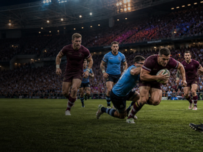
 27 May - 8 Jul 2026 - Australia

 Flag
Flag
Night Theme
Same four components, dark tokens. The phone frame uses the same HTML classes.
PC componentsnatural width